loading
Wild Americas
designing the player experience for a new adventure
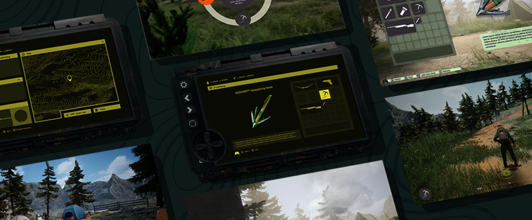
I had the opportunity to work with Upsetter Studios, building the user experience and visual design of their upcoming adventure game Wild Americas. As my first professional design project, I learned numerous technical and professional skills. Tools such as Unreal Engine 5 and After Effects were important experience, but so was learning to work with developers and how to communicate with stakeholders.
timeline
- June - December 2023
disciplines
- user interface design
- graphic design
- visual design
tools
- Unreal Engine 5
- Figma
- Illustrator
- Photoshop
- After Effects
- Procreate
skills
- wire-framing
- user-research
- prototyping
- mockups
- competitive analysis
context
Wild Americas is an adventure video game that sees players exploring the American wilderness through the eyes of a geologist sent to survey an island. As the game unfolds, players encounter a wide cast of the islands residents and experience the entire story through both gameplay and tie-in comics published.
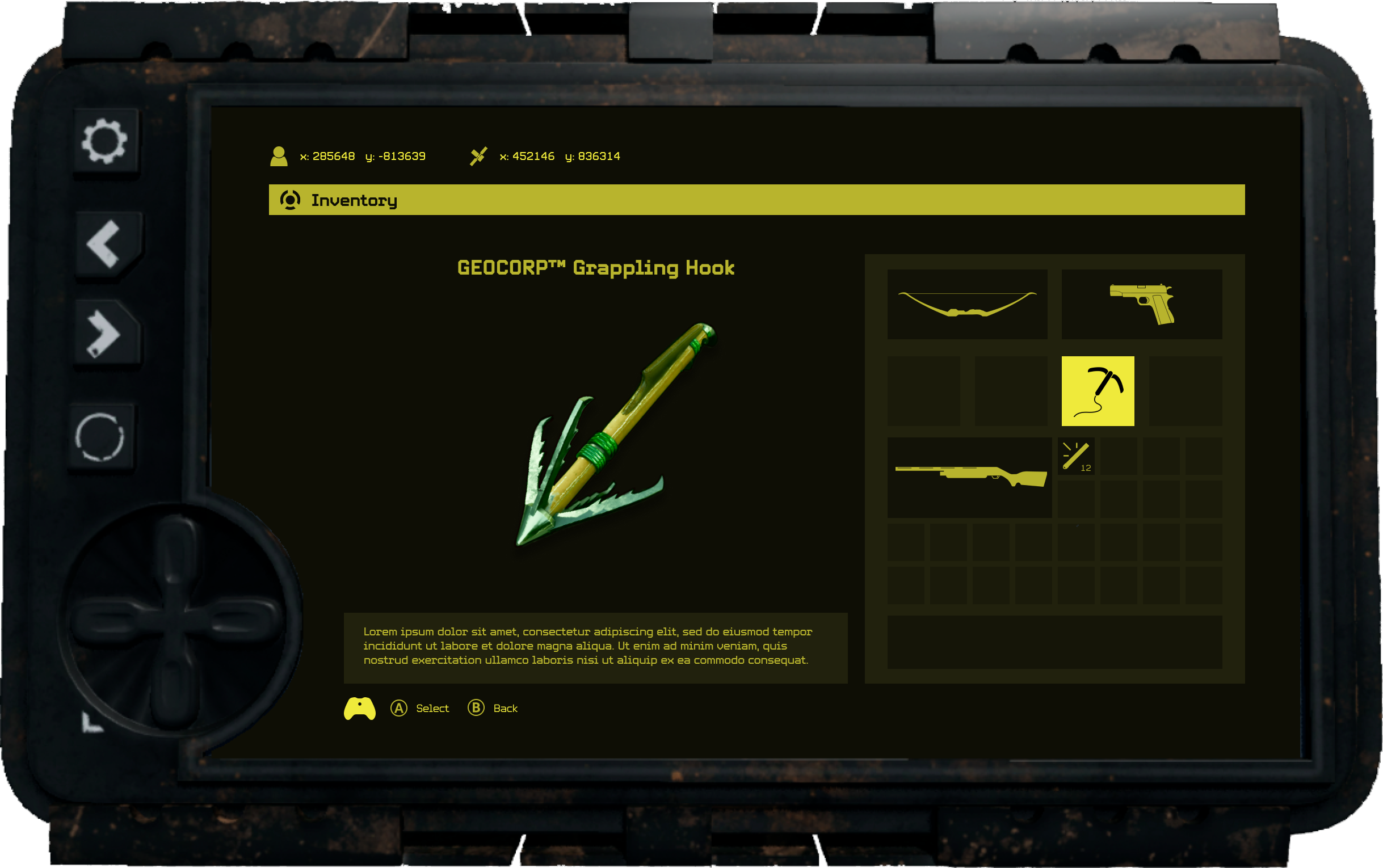
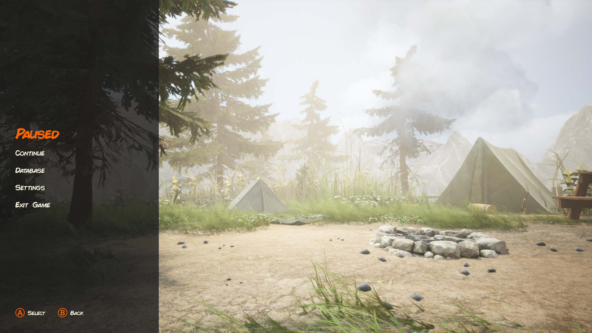
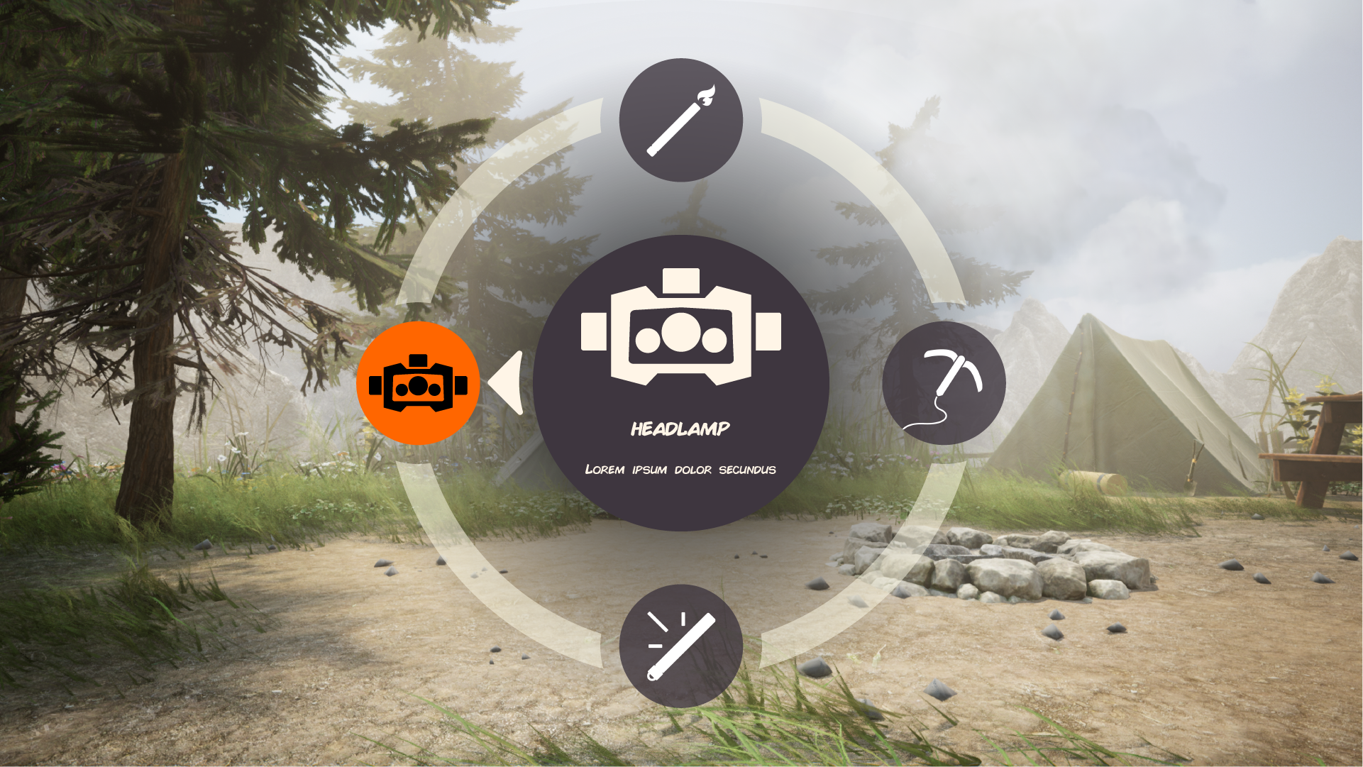
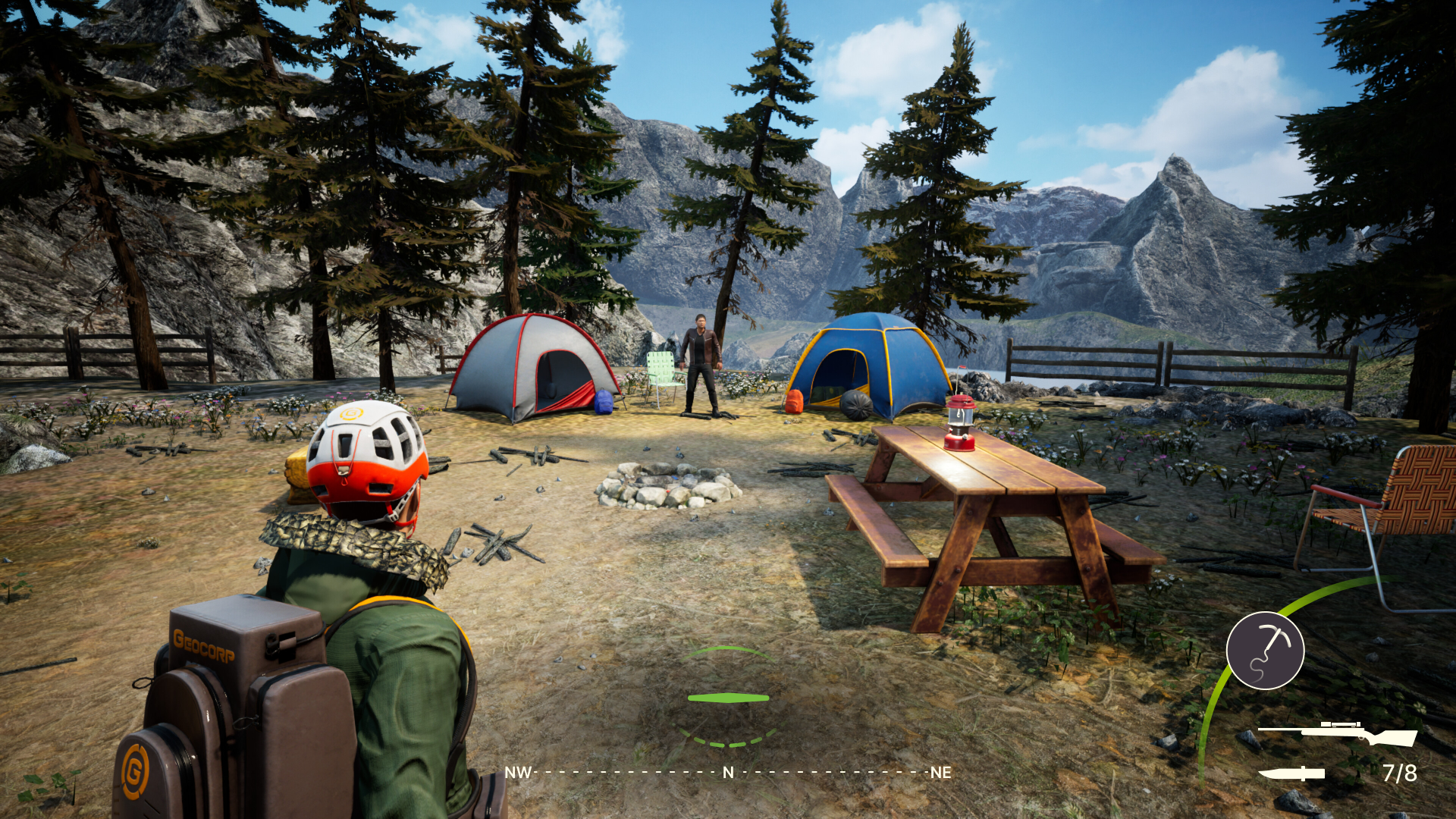
I was tasked with designing the interface of the game, which encompasses the players HUD, inventory, main and pause menus. Since it was a small dev team, I was also responsible for the visual design tying the UI to the game.
goals
My goal is to design the player inventory, quest tracker, main and pause menus. This includes the heads up display or HUD for the game. I will have to create the visual design assets to bring the game together into a cohesive style.
constraints
platforms
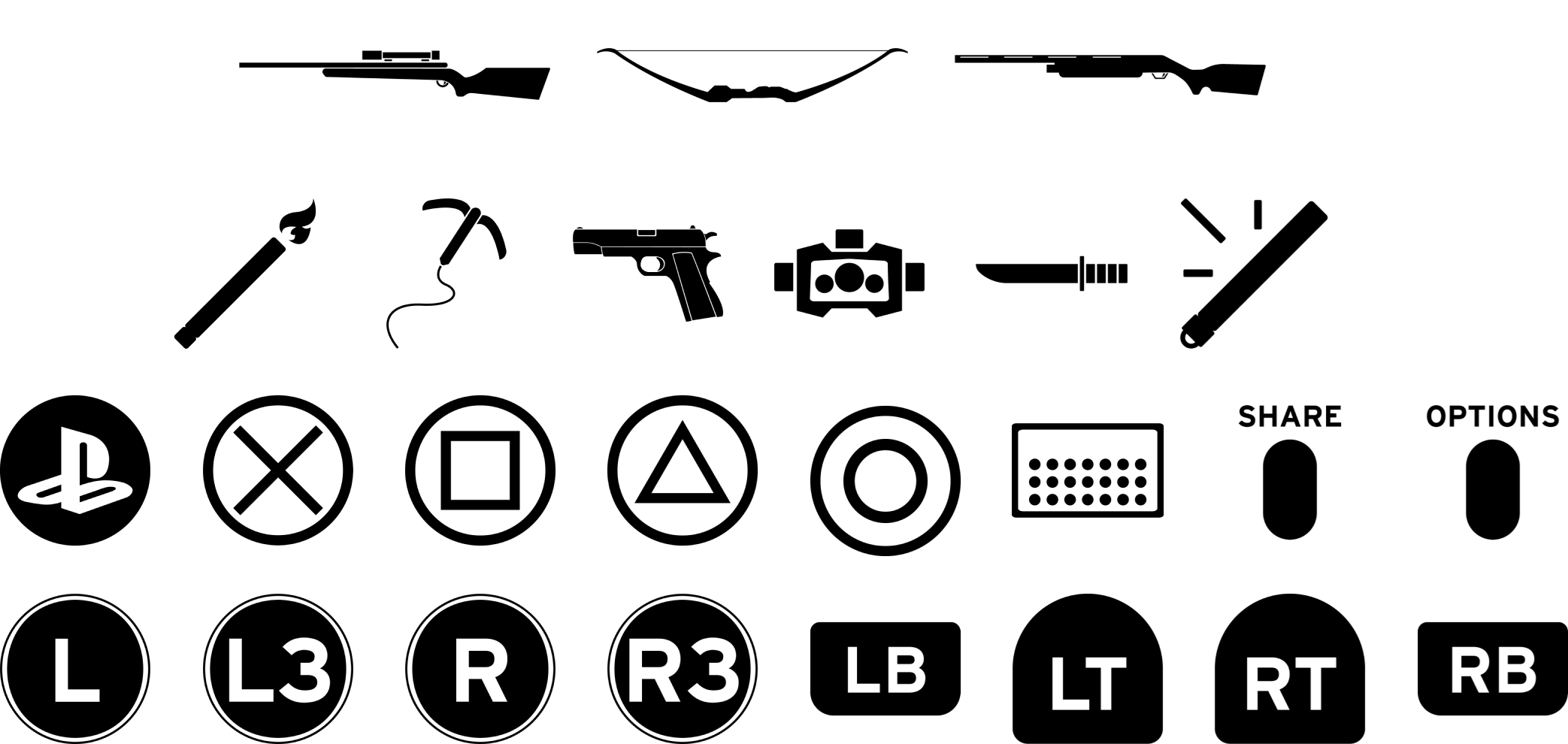
Releasing on both consoles and pc, the control scheme for navigating menus will need to be adaptable to different platforms.
accessibility
The menus contain essential information for gameplay, and accessibility should be considered to allow more users to enjoy it.
diegesis
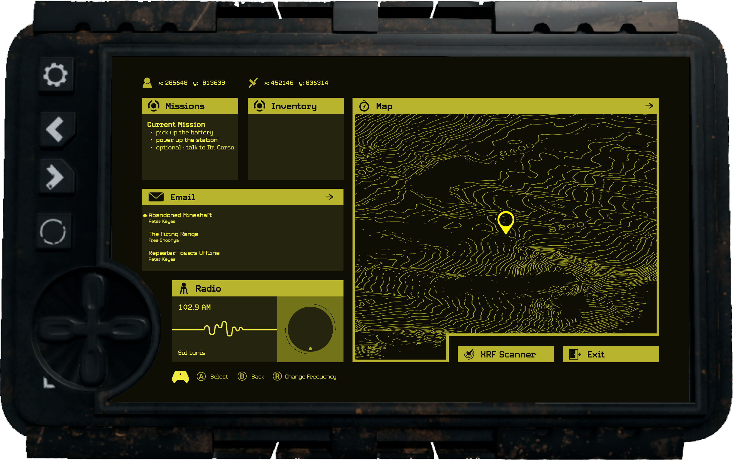
Several menus will be accessed through an in game computer called the MGS. They will need to feel as if they exist in the setting.
competitive analysis
Equipped with an understanding of my end goal and constraints, I looked to other games to see how they have solved these problems. Looking at how they organize and present information for players. Documenting where and how they succeed or fall short.
ideation
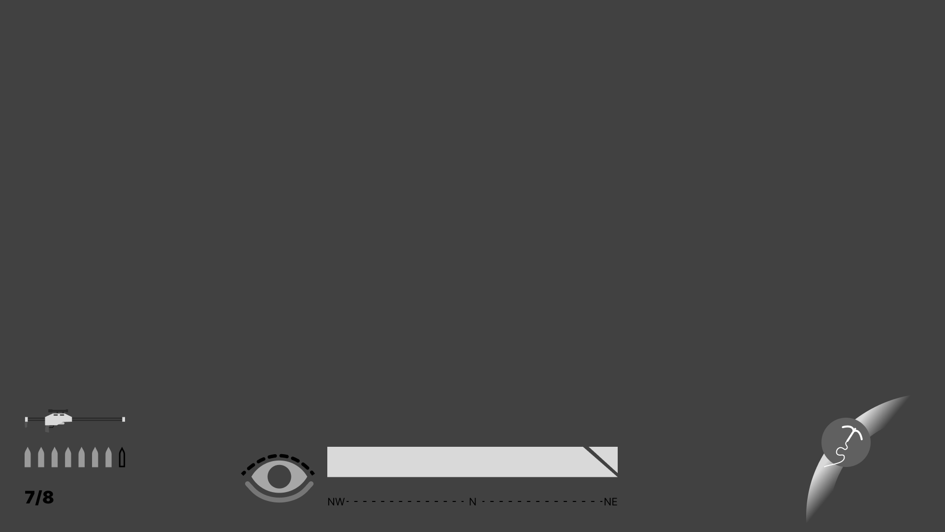
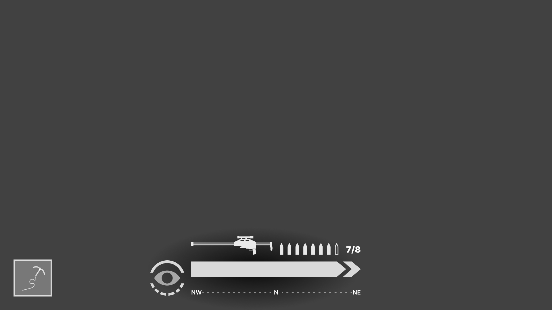
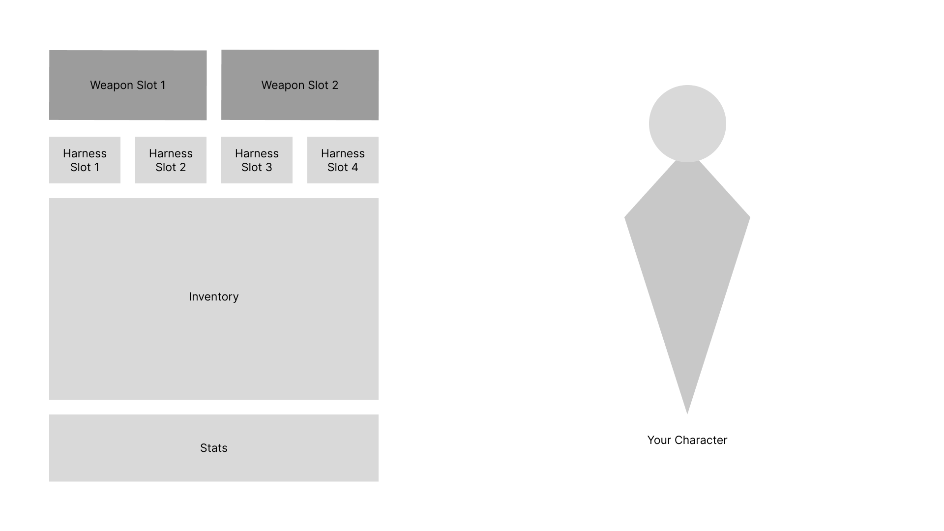
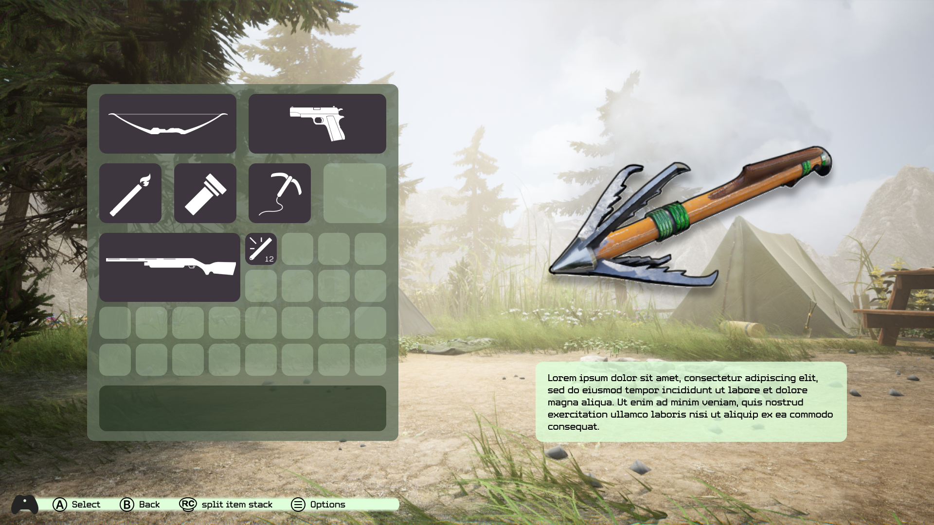
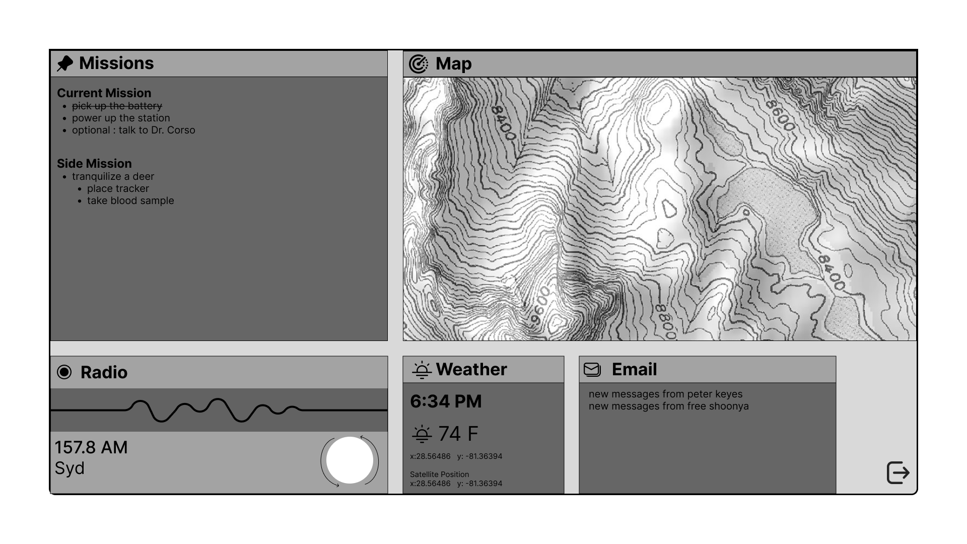
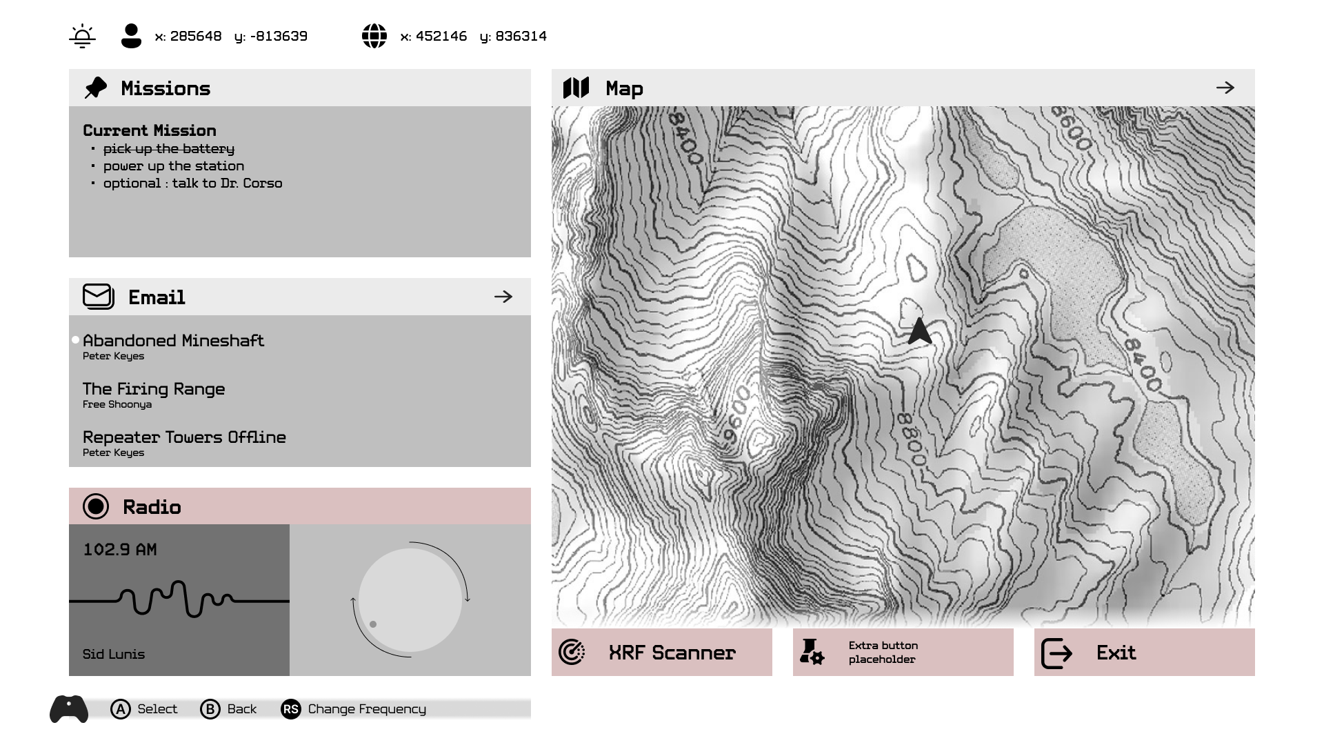
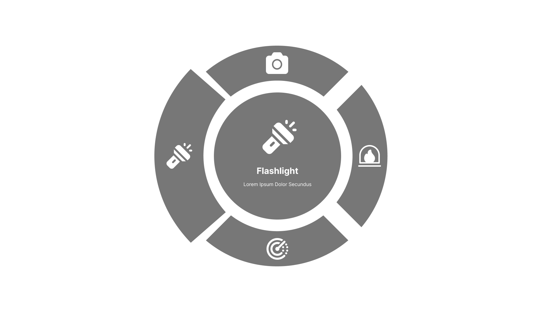
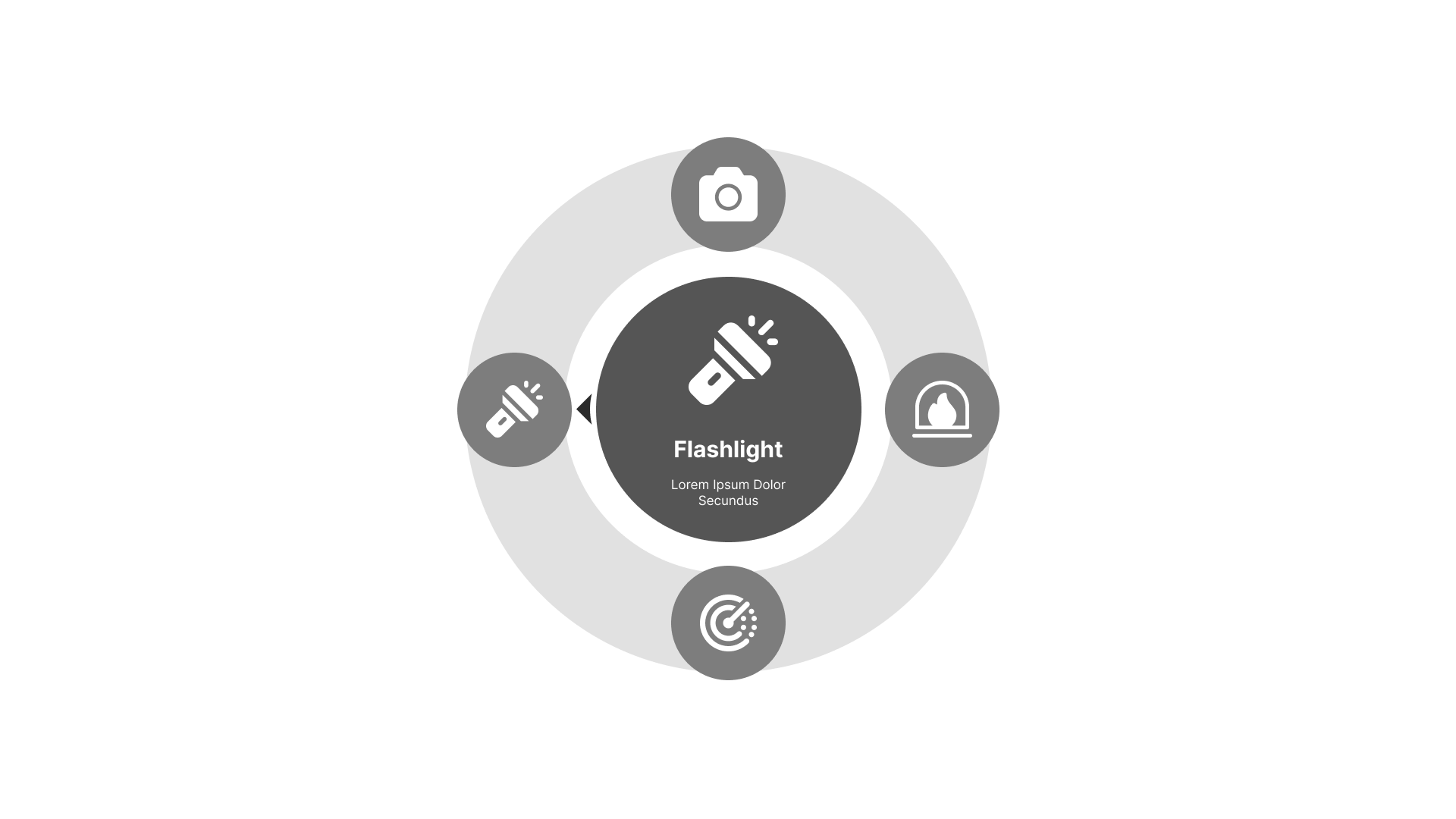
Utilizing my research, I could now get to work designing the UI. Rapidly iterating, I first created wireframe layouts, then built prototypes from there. Collecting feedback between rounds of iteration to improve. Spending more time with each prototype to increase resolution as I went.
HUD

Inventory

MGS

Radial Menu

synthesizing feedback
As part of my design process, I presented designs after each round to gather feedback from the team. With the mid-fidelity prototype however, I asked for some deeper critique. Gathering data from user tests, I synthesized them into insights. Using these to create the final design.
more from less
I had to learn to leave as much white space as possible when designing. Using internal feedback I refined to show exactly what the player needed to know using as little space as possible.
contrast
when playing a game, the players HUD is set against a constantly changing background. I had to adapt to this problem creating backgrounds that blend in but still allow for consistent legibility.
navigation aid
the most implicit insight from feedback is players were losing themselves in the menu. By highlighting where the cursor is currently focused,players were able to center themselves amongst the noise.


lessons learned

Unreal Engine 5
Unreal Engine 5 was a huge boon to learn throughout my internship. Familiarizing myself with blueprints, I began to contribute to tweaking mechanics and level design. Building white box levels and QA testing gameplay by the end of my internship. Unreal is such a powerful tool, I continue to learn it even now.
Scalable Systems
Scalability was probably the most valuable lesson I learned while designing for Wild Americas. Creating a design system with the team allowed me to iterate faster, more consistent UI. Time is precious to a small dev team and a scalable design system allowed us to make the most of it.
After Effects
To illustrate more complex motion designs, I decided to learn After Effects. Although it took time, the effort to be able to show the dynamism is far and away more powerful than my previous tools. I look forward to applying it more in coming projects.

Interdisciplinary Communication
As a small team, I worked directly with the lead developer to implement designs into the game and had to learn to communicate ideas with them. Improving my ability to translate my design work so that it could be handed off to others seamlessly.
next steps
Over my time working on Wild Americas I rapidly learned tools like Unreal Engine and skills creating more scalable design systems. If I were to continue, I would be excited to refine the UI further utilizing moderated play tests. Working with player feedback to help bring an amazing adventure together in Wild Americas.
Thank you for taking the time to follow my work with Upsetter Studios. It was a dream come true to work on a video game and the experience was extraordinary.
more projects
Beau Gonzalez
ux designer
