
loading
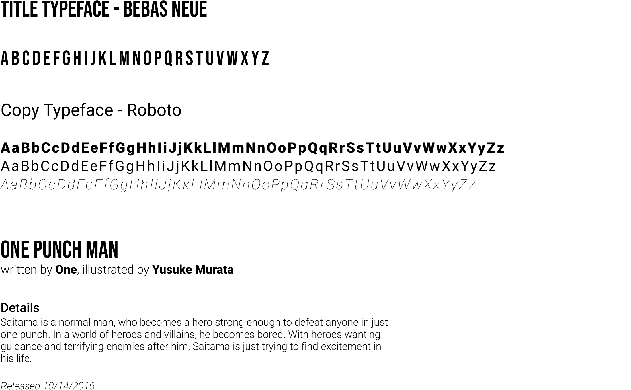
Shonen Jump
redesigning for more accessible manga reading experiences
Redesigning the Shonen Jump manga app for mobile and tablet devices, I created this as a personal project while pursuing a certificate in user experience design from Google. Learning about information architecture and Gestalt principles, I thought the best way to get these skills to stick was by applying them. Setting my own goals and constraints, I learned to work within existing brands and a new understanding of tools like variables and components within Figma. Rebuilding the Shonen Jump app to have a lower barrier to entry and accessible for all.
timeline
- May - June 2023
disciplines
- user interface design
- user experience design
- visual design
- graphic design
tools
- Figma
- Illustrator
- Photoshop
- Procreate
skills
- User research
- Sketching
- Story-boarding
- Wire-framing
- Prototyping
- Mockups
what is shonen jump?
Shonen Jump is a manga magazine, publishing comics or graphic novels originating from Japan[1]. Creating international pop culture icons from Dragon Ball to Demon Slayer, Shonen Jump has boomed in popularity worldwide.
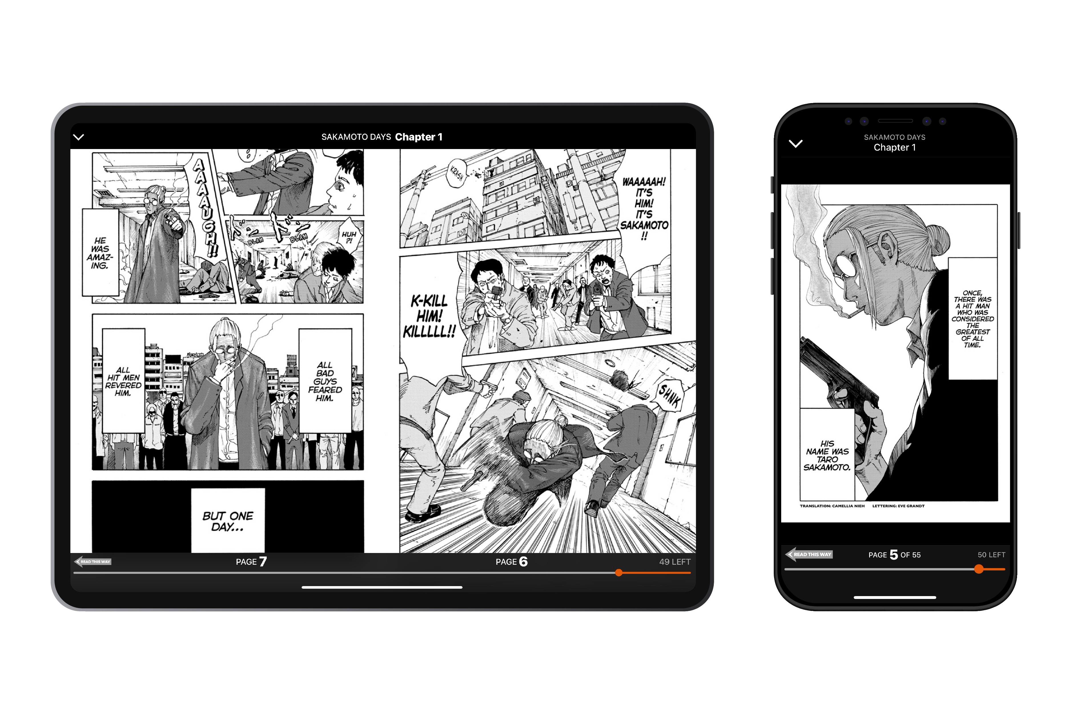
Publishing chapters of stories weekly, readers can choose to either pay a subscription fee of $3 to read each chapter as they release, or buy them collected into a book called a volume. Shonen Jump's magazine also includes parts beyond their manga, holding contests, interviews with mangakas or authors and even merchandise.
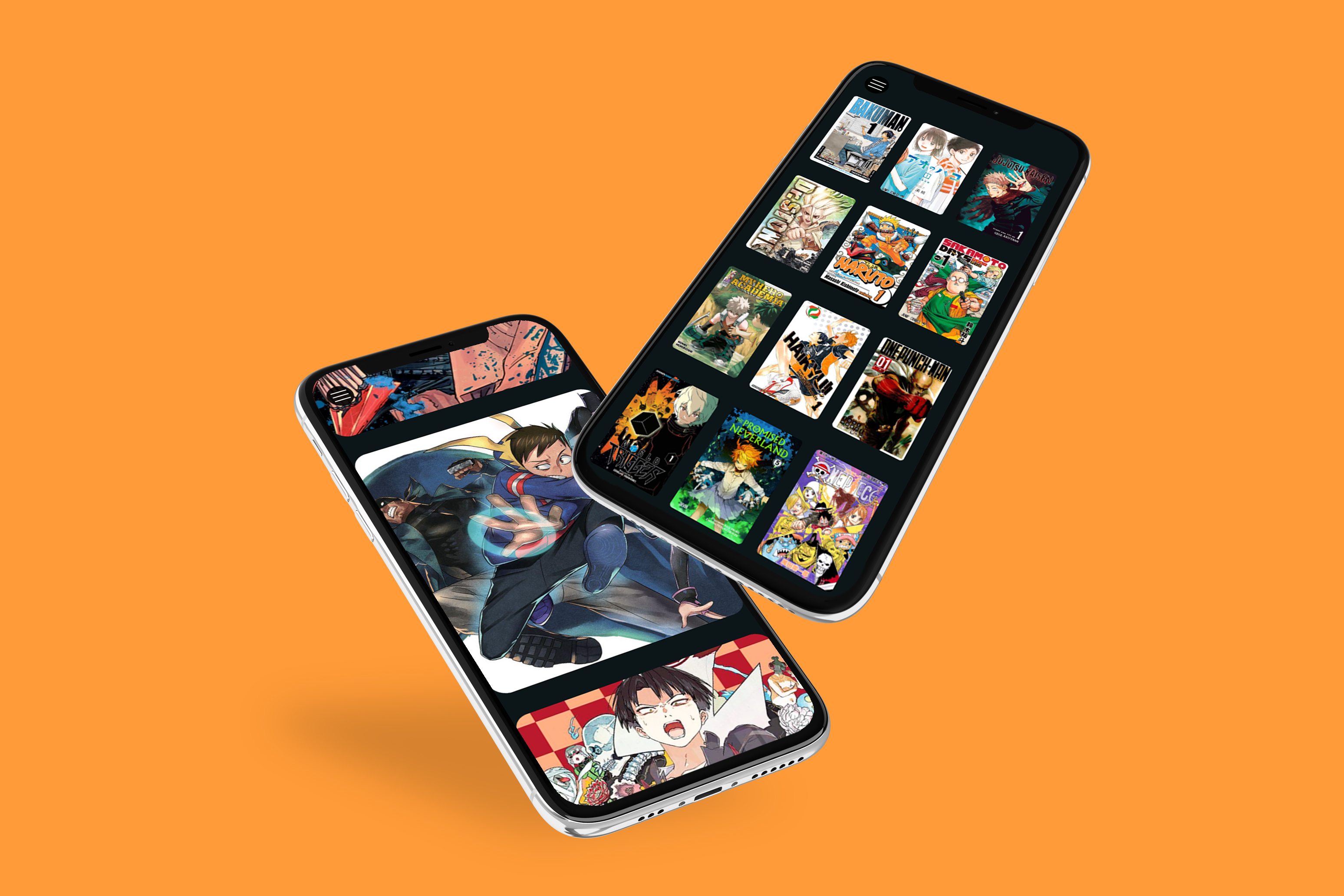
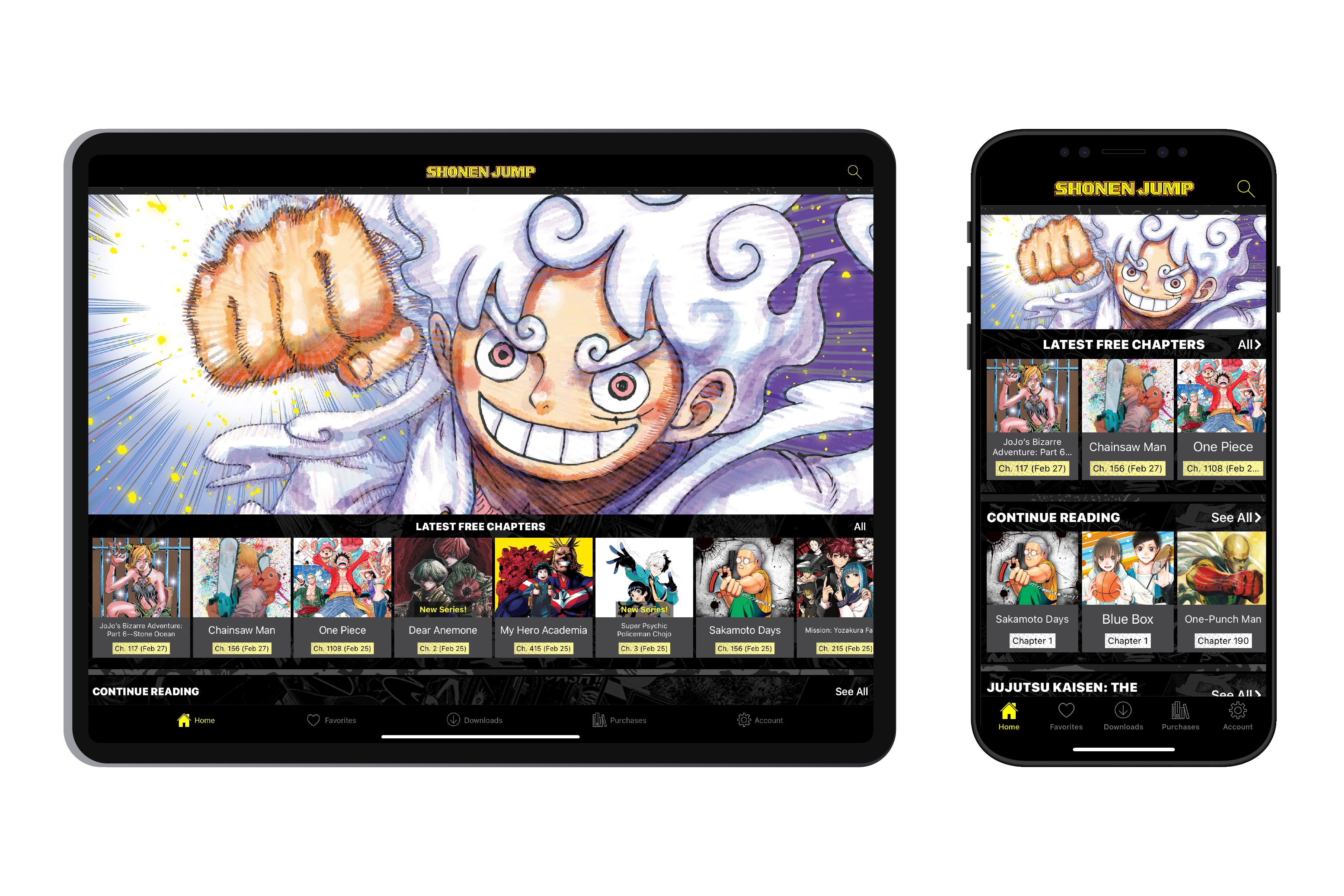
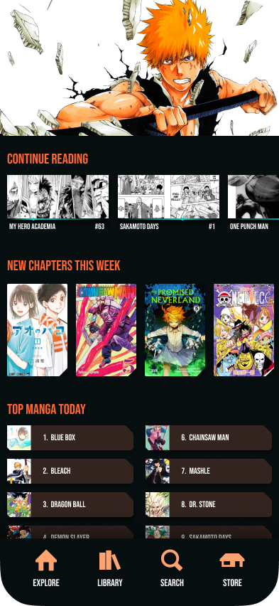
The Shonen Jump app is based around reading their manga. Users can subscribe to access a wide range of series, favorite the stories they like, and download them to access offline. Some titles are only partially included in the subscription, or must be purchased in volumes on the app. However there is no dedicated store on the app, adding a confusing barrier to audiences. With roundabout information architecture, newcomers to the medium hit an unnecessary wall. I seek to make manga more accessible.
the original app
goal
Shonen Jump has a wealth of amazing stories to share, but their app can be difficult to navigate at times. The goal is to redesign their mobile and tablet apps to improve the navigation and overall accessibility of manga.
discovery
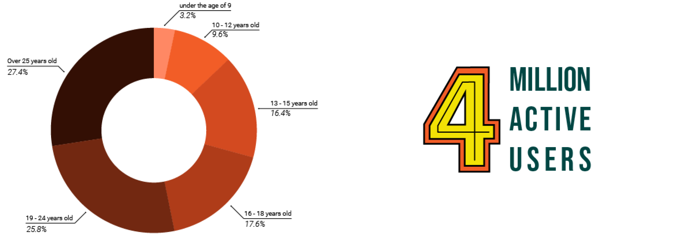
As of 2021, the app was downloaded by over 17 million users and accessed by an average of 4 million people weekly. Though the magazine was originally aimed towards teenage boys, in recent years it's readership has widened both in age and gender. As Shonen Jump grows, the app's use cases should reflect this widening audience.
current architecture
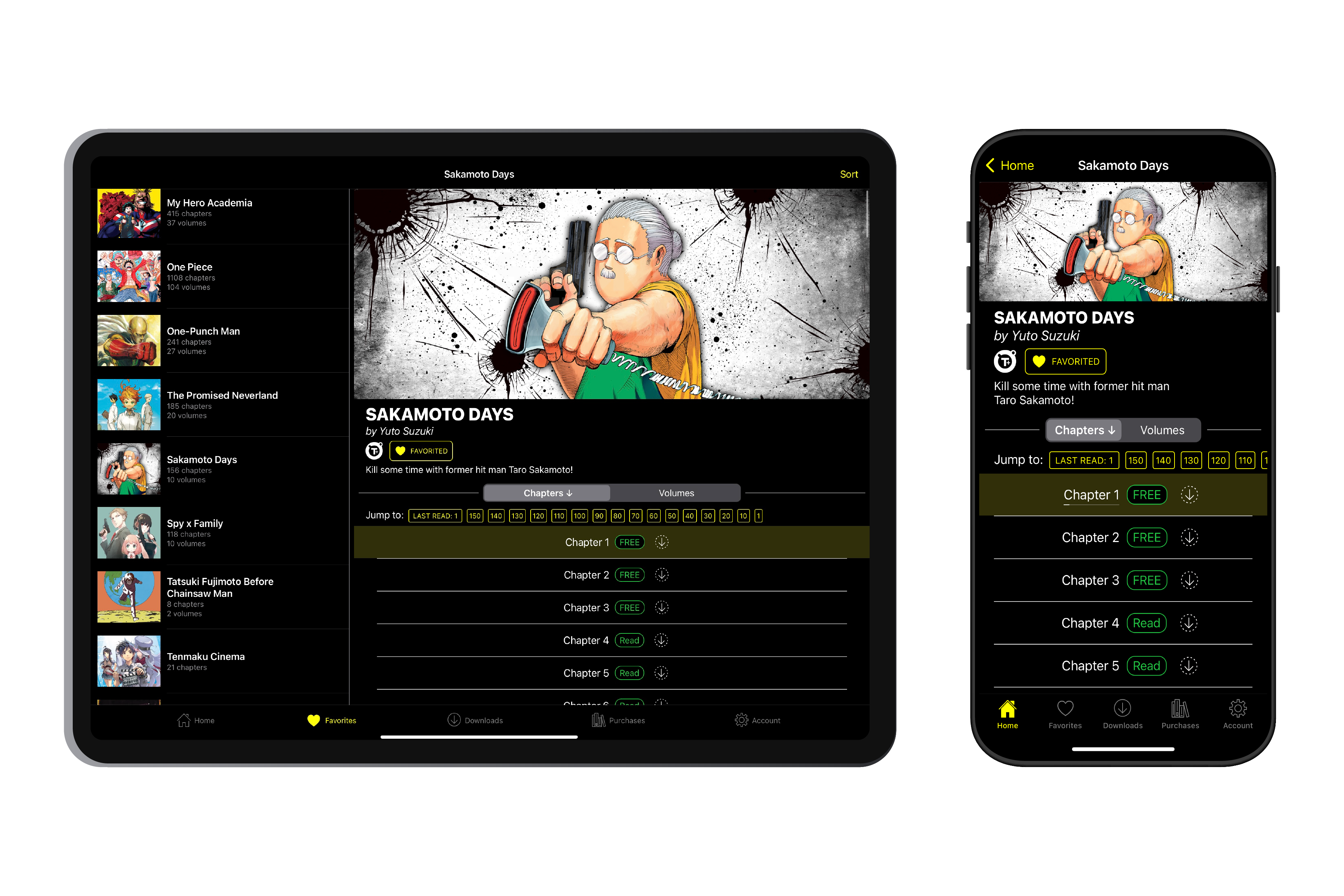
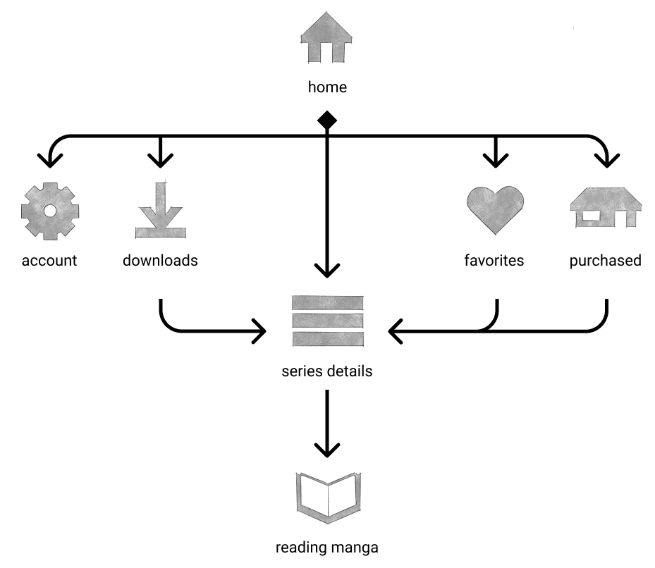
The Shonen Jump app's confusion issue is more implicitly an information architecture problem. When a user clicks on a manga, it will always lead to the exact same series details card. No matter if it is from downloads or purchased, you will reach the same spot. This is a problem of redundancy. These pages should either serve different purposes or combine into one single page if they serve the same purpose.
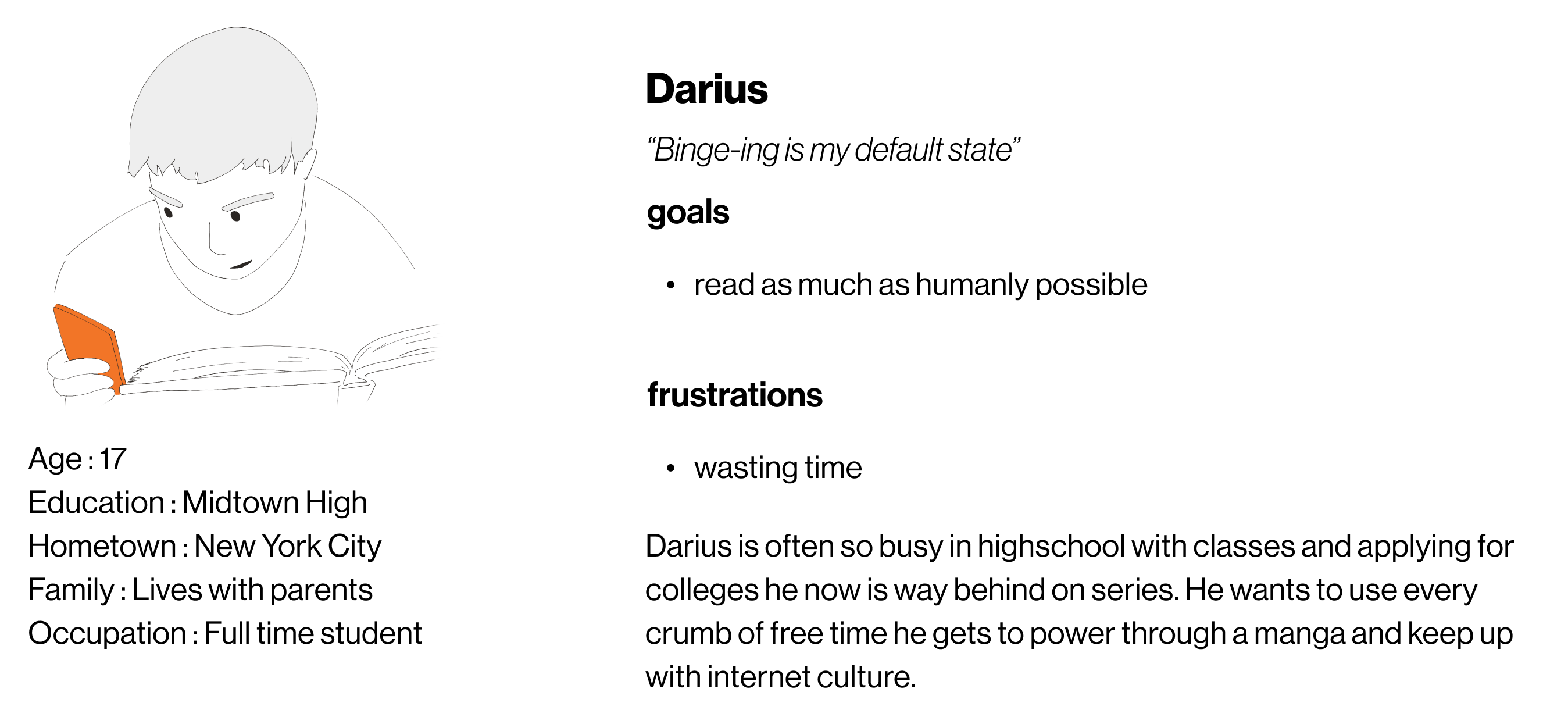
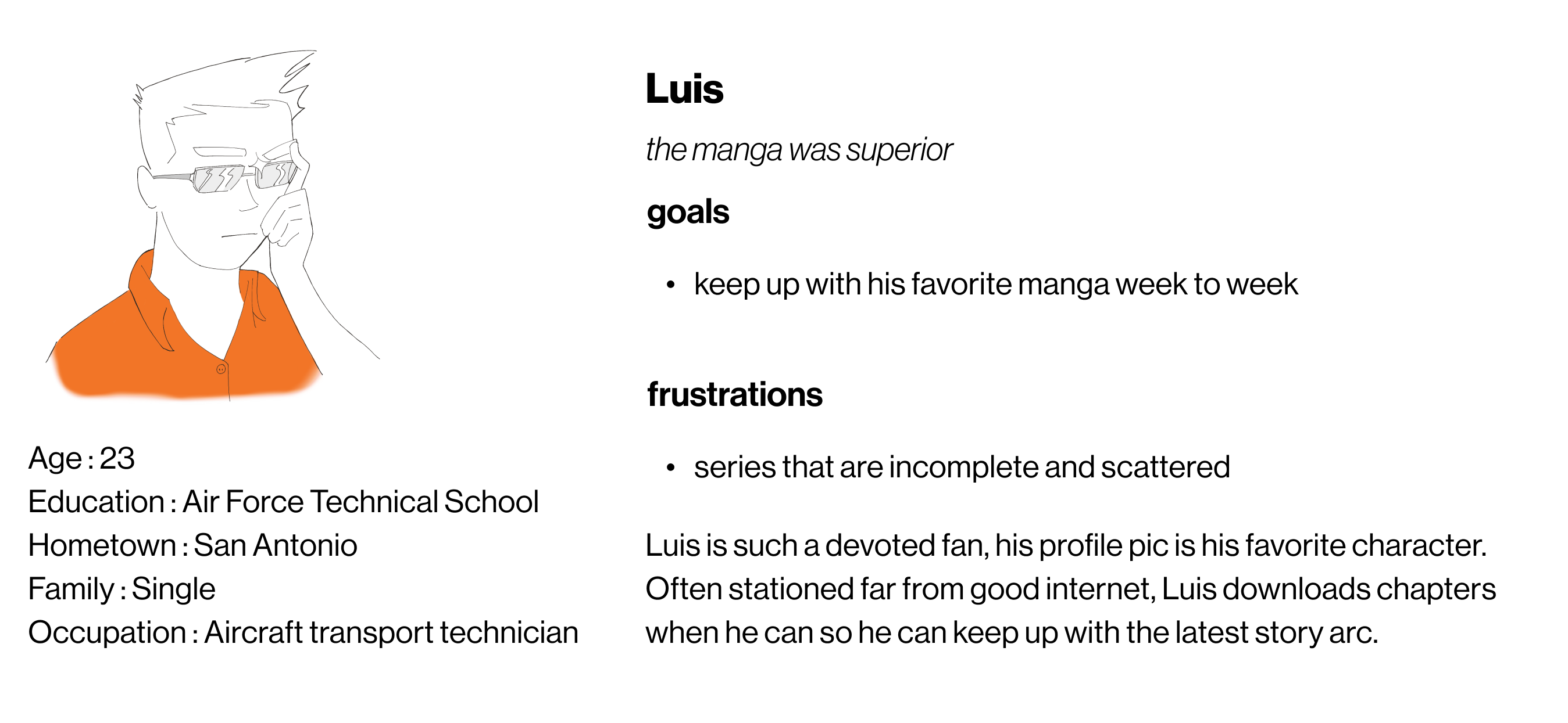
personas
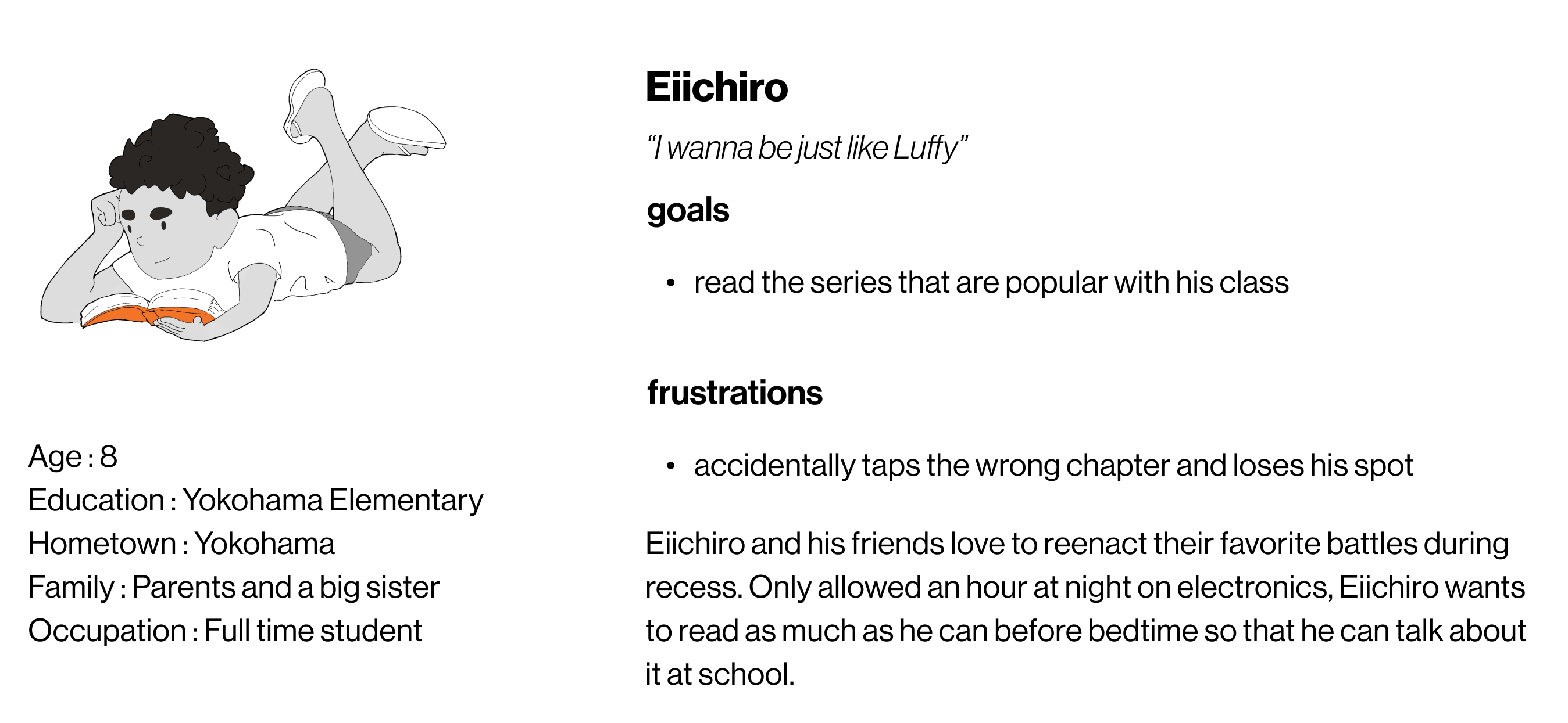
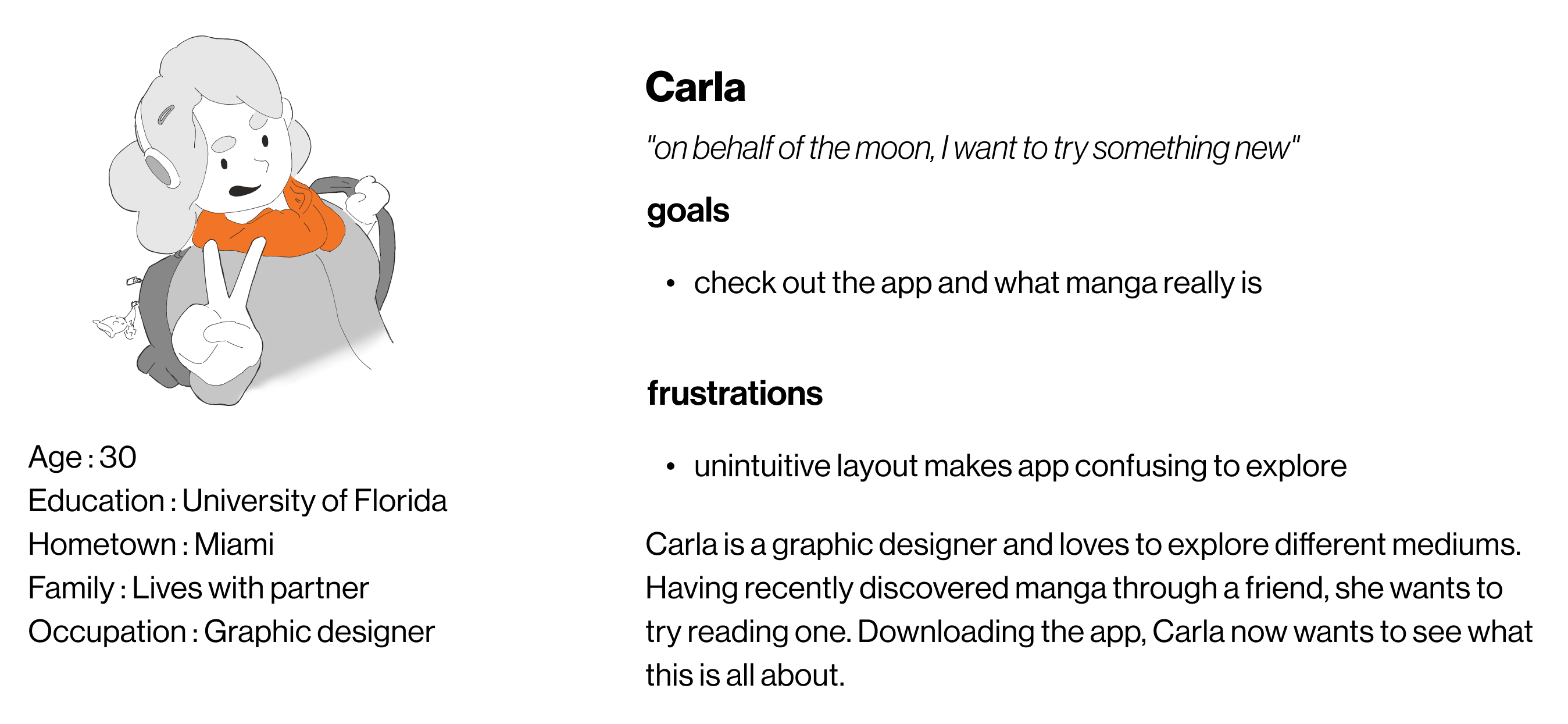
As I learned in my research, Shonen Jump continues to grow, it’s audiences have grown literally. Originally targeted towards teen boys, demographics have since shifted, 53.2% of readers are now over 19 and an increasing percentage of readership are female. I assembled personas to reflect a more modern Shonen Jump audience.
competitive analysis

marvel unlimited
A subscription based comic reading app for all stories owned by Marvel comics and a direct competitor. They offer a powerful search feature that allows you to search by series, authors, and issues. However, there is no way to sign up for the service within the app, and you cannot preview an issue or series before signing up for the service. We can learn from their search feature and offer a way to sign up for Shonen Jump within the app.

comixology
An app intended for anyone to be able to read nearly any mainstream comic, Comixology boasts a massive catalog. The app offers several accessibility options for reading and you can preview a series before you buy it. It is not without problems however. The biggest flaw is the inability to purchase comics. You must purchase all comics through amazons app or website instead. Turning a simple one or two step transaction into a ten minute ordeal. Shonen Jump can learn from their excellent accessibility options and streamline purchasing.

webtoons
A newcomer to the industry, Webtoons is an app with more international and indie comics. With a unique single page format for displaying comics, readers scroll vertically to reveal the next panel rather than turn the page. Webtoons has a strong app because they have a strong design aesthetic, and excellent organization. Sorting titles in a variety of ways, and deliberately displaying only a few at a time allows users to take information at their own pace. Shonen Jump can learn from cohesive design aesthetics and Webtoons organization philosophy.
ideation
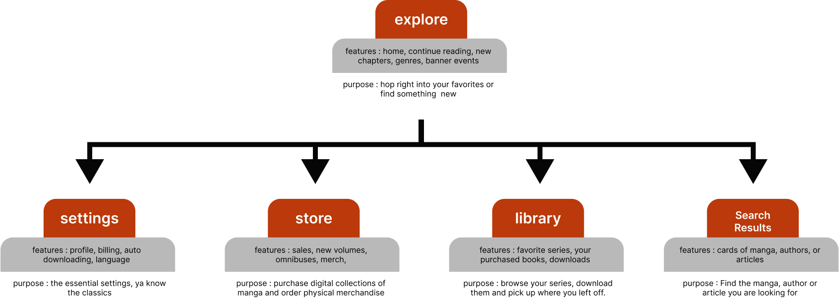
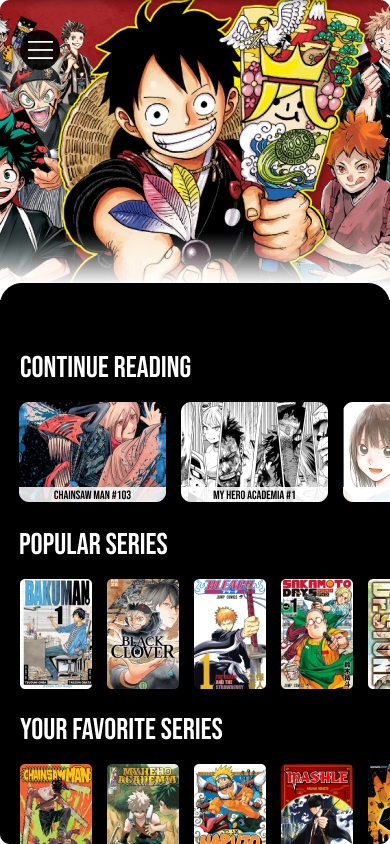
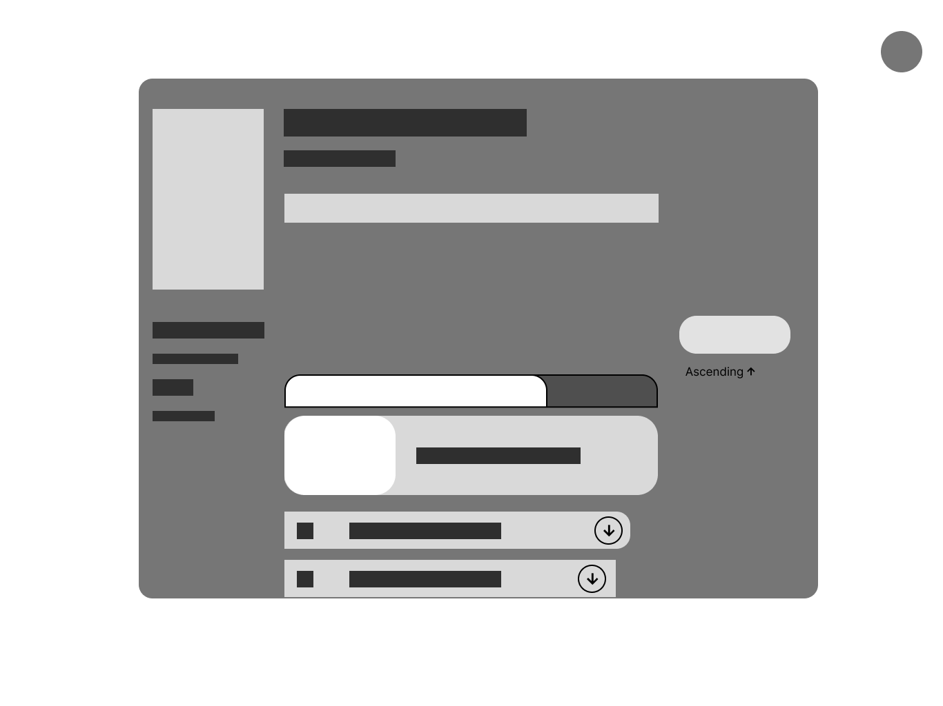
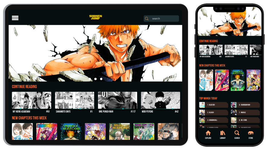
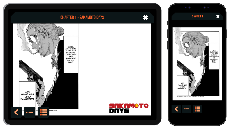
With an understanding of my users and the problems they face with the current app I began designing solutions. Planning a site map allowed me to define exactly the purpose of each page, and how they connect. Rapidly prototyping wireframes and fitting together the best aspects of what I had learned along the way. Implementing ideas like a continue reading for readers to quickly pick up where they left off.


final design
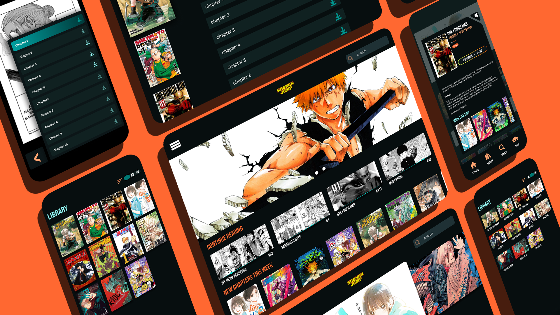
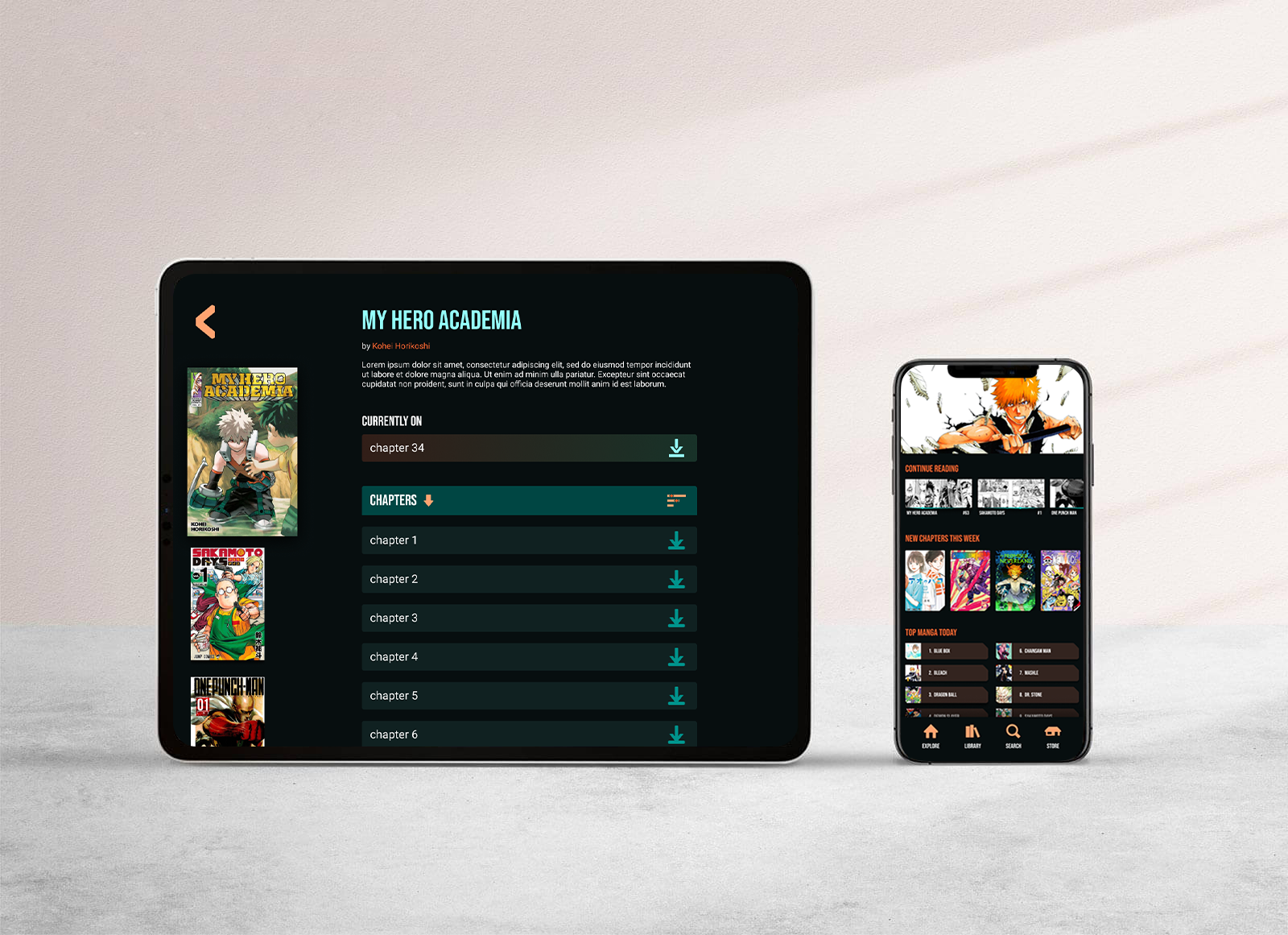
new information architecture
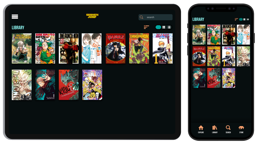
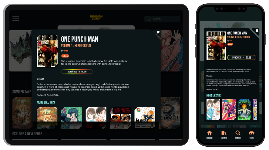
To improve navigation, I restructured the information architecture of the app. Consolidating the downloads, favorites and purchased cards into a new one called library. I then created the store, a place dedicated specifically to purchasing volumes, that are then added to your library. These pages can all lead to reading still, but serve different purposes. Now that each feature in the app has a specific role, people can begin reading manga faster than ever.

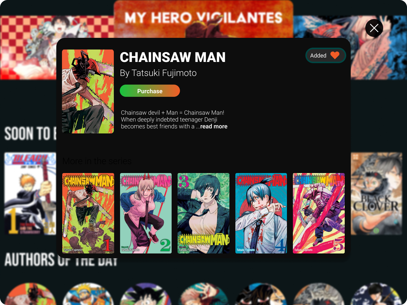
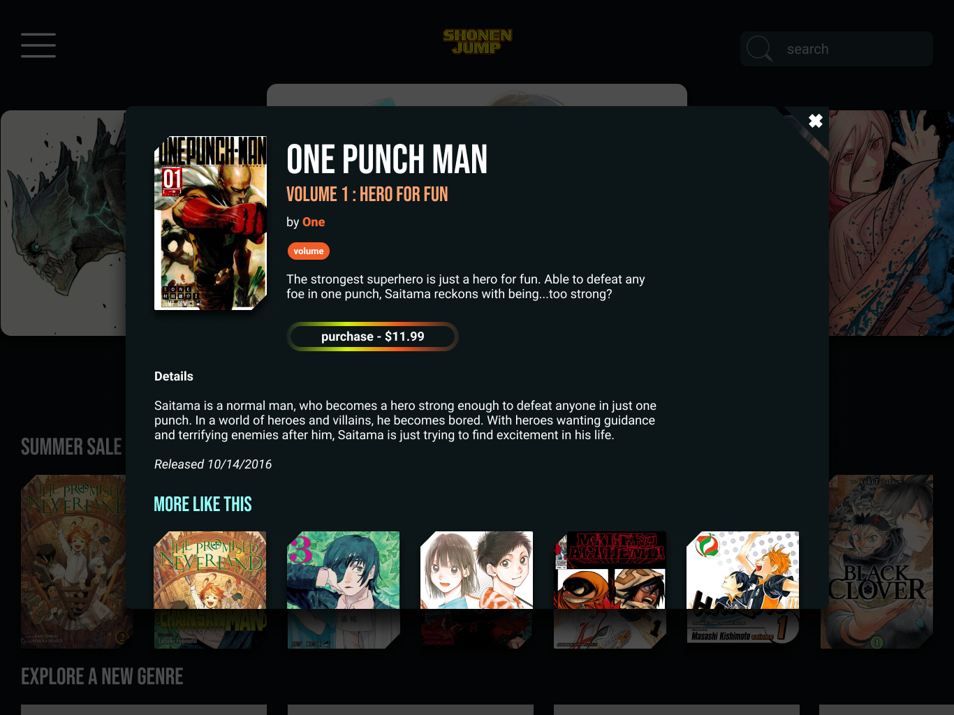
introducing tags
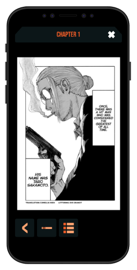
New users had trouble knowing the difference between individual chapters, collections of them known as volumes, and the overall series. I created a tag system that tells users what the item they are looking at is, and if tapped on, explains the tag. This helps ID the product without bogging every page down with text.
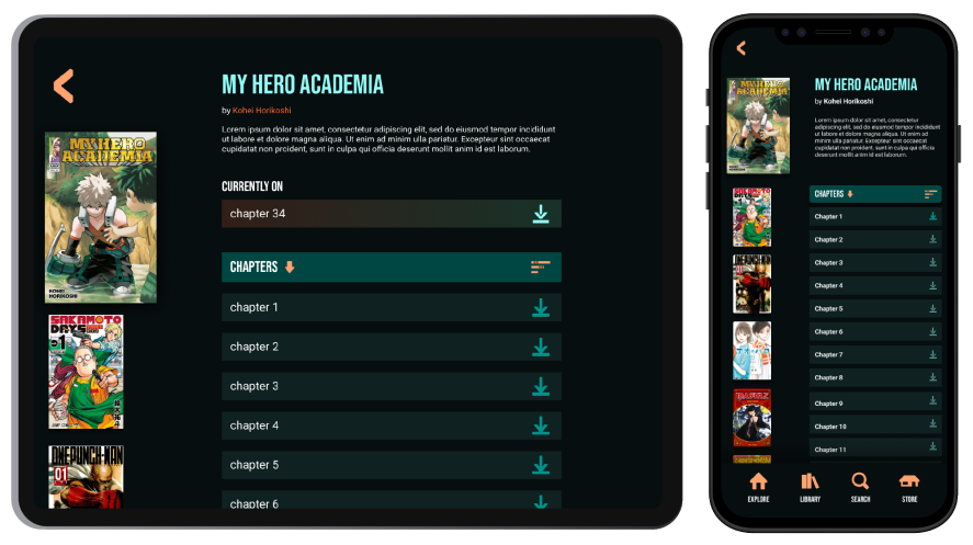
improved search
On the original app users could only search for series which will only pull chapters up. I expanded the search function to have a dedicated card that searches by volume names, articles and authors related to the search term. This way users can learn more about a series or an author easily.
design guide
Redesigning the app, it needed to fit within Shonen Jumps pre-existing brand to be a success. I created guidelines based off of their properties, referencing it throughout. Creating colorful iconography and punchy typefaces that blended right in with Shonen’s style.
lessons learned

Figma
Although I had used Figma before, I learned to use variables and components on this project. Variables allowed me to create high fidelity prototypes and components were key to scaling up the project as it went.

Sticker Sheets
While creating this project, I learned about design systems sometimes called sticker sheets in a Google UX course. Wanting to apply it, I found it essential to building my final prototype. Using a design system in UX brought cohesion to the overall design and halved the time it took to create cards.

Information Architecture
Another incredibly valuable lesson I learned from the Google UX course was in the principles of information architecture(IA). Organization dramatically changes an experience, and was new to me coming from industrial design. I enjoyed applying these lessons to improve Shonen Jump.
next steps
Designing under an existing brand was a great experience, even as a self guided project. Having created a high fidelity prototype, I would like to test it with my audience. Conducting small scale user testing would reveal problems and perspectives that I could improve in the next iteration. I hope to send this to Shonen Jump’s parent company Viz Media to at least consider a few of these changes.
more projects
Beau Gonzalez
ux designer


